Striking, ingredient-focussed graphic design project for a new range of African black soaps for leading UK hair and beauty brand – Mamado.
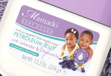
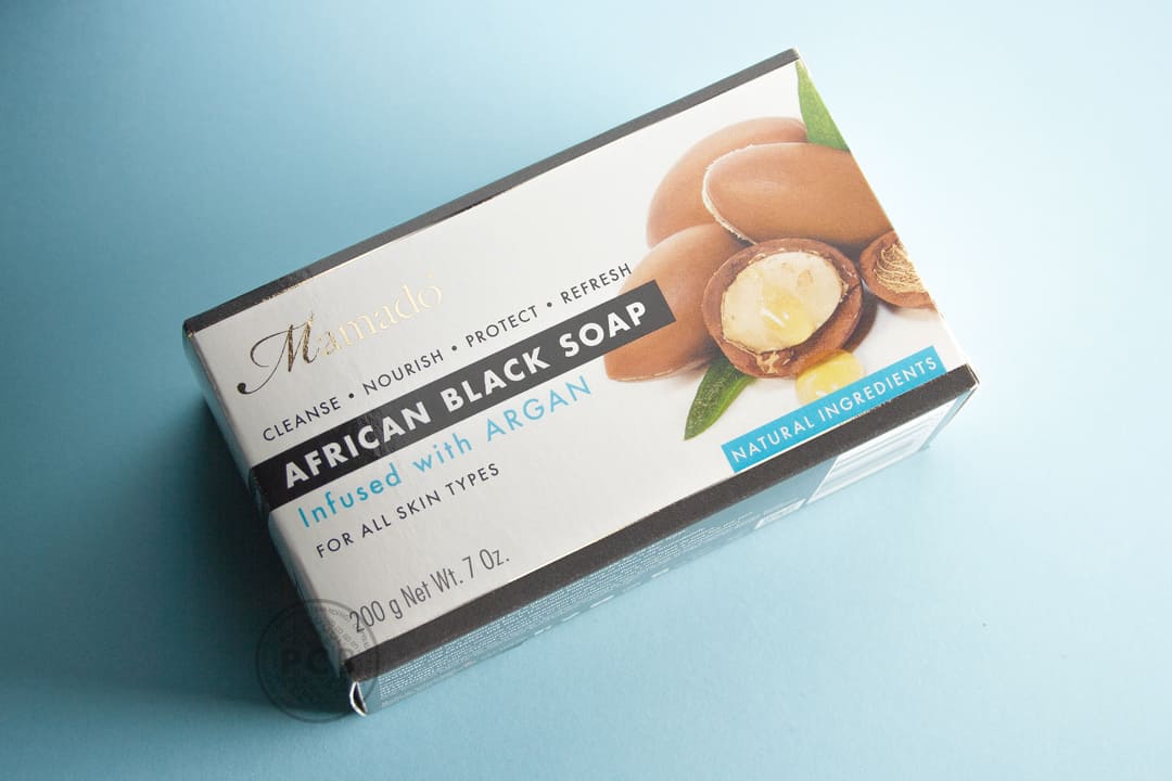
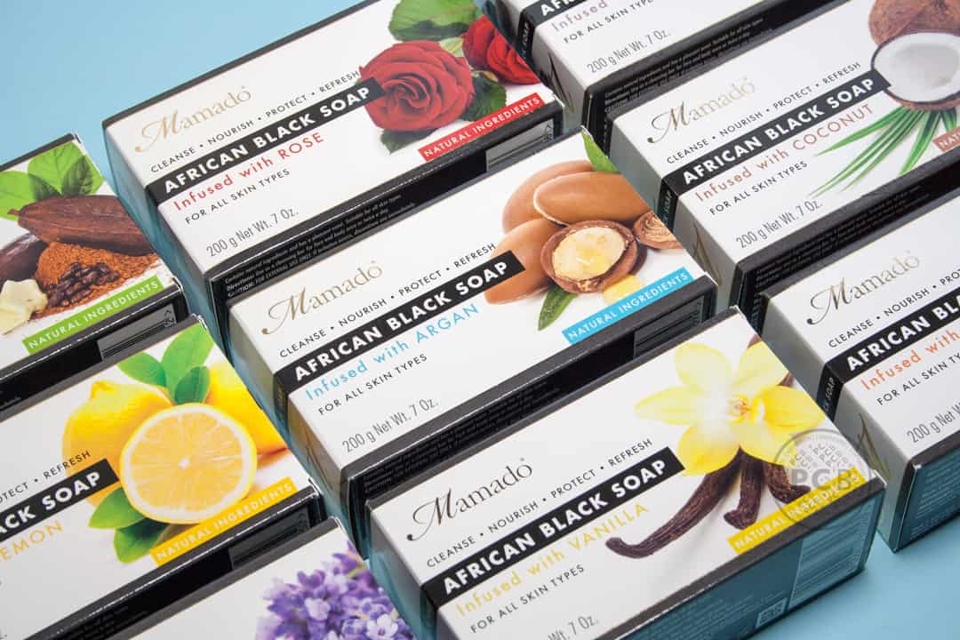
Adding to the ever-expanding Mamado brand, we were asked to design the box graphics for a new range of black soaps. The black coloured ‘African black soap’ is currently a highly popular and competitive market and one the client wanted to explore.
Having already designed the label identity for the brand’s range of aromatherapy and essential oils, a strong design framework already existed, including the brand logo, font family and stock photography images.
Our challenge this time, was to balance this existing identity with the specific ingredients of each soap infusion with the title; ‘African Black Soap’ – an important requirement of the client.
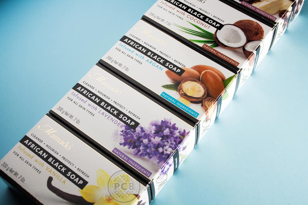
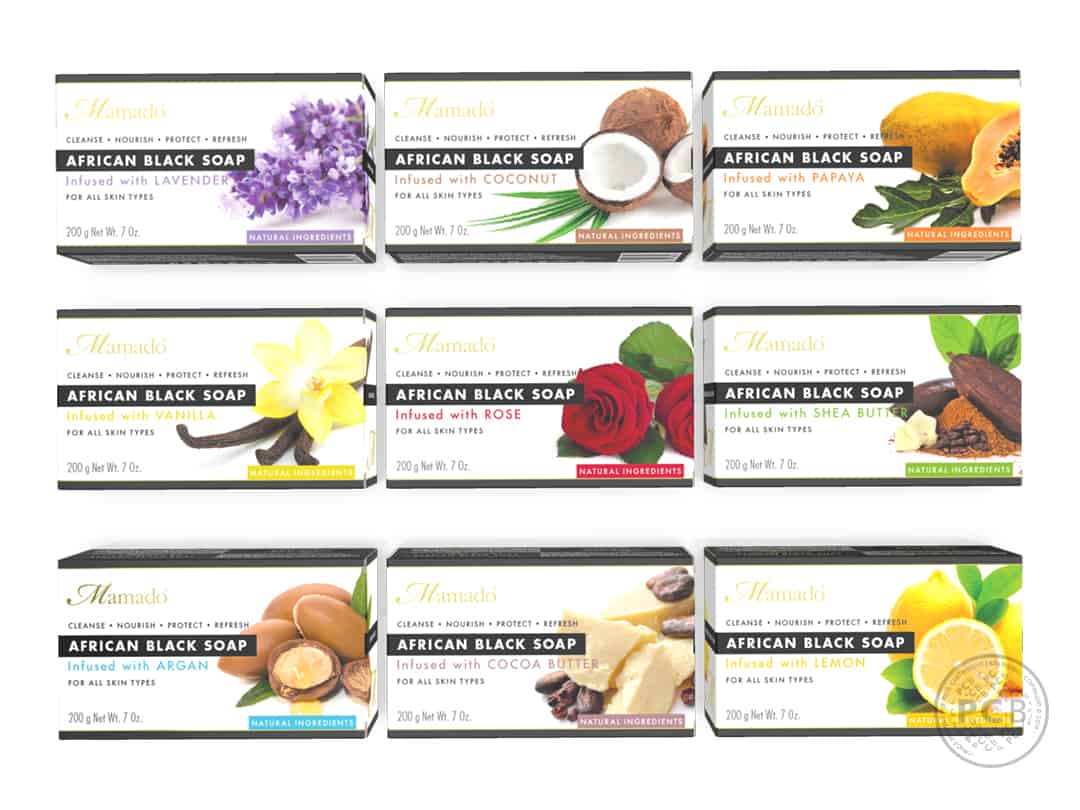
An element of ‘black’ colouration (typical of other competitor products in the African black soap market) was introduced through the use of a bold, black band featuring the product title. This was coupled with a dark grey colour to the top and base of the carton, leaving a continuous white space around the centre of the soap carton. This band then left space for the product information and close-up ingredient imagery.
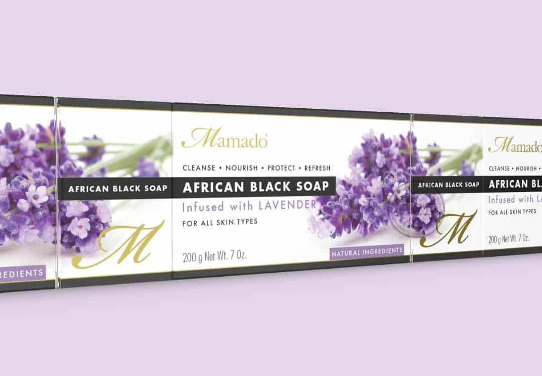
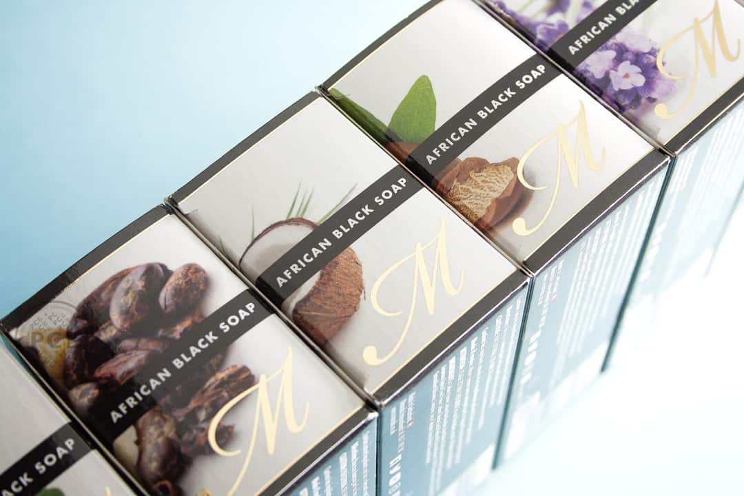
The image of the ingredient and the black band or ‘ribbon’, featuring the title ‘African Black Soap’, runs around the front and one side, the image repeating allowing for clever on-shelf merchandising and display.
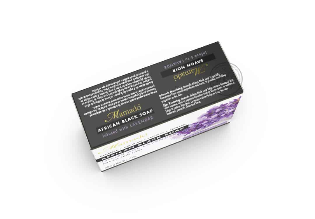
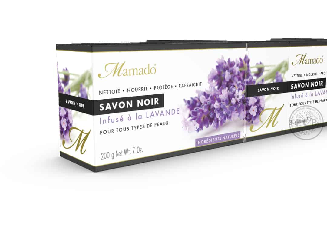
As the market for this kind of soap is often based in French-speaking countries, the packaging needed to feature both English AND French text in equal balance. So, the boxes have been designed with a front and side face specifically designated to each language and at the same time, maintaining a consistent design layout.
Colours sampled from the large scale stock photography images are used as colour-coding on specific graphic elements across the soap boxes.
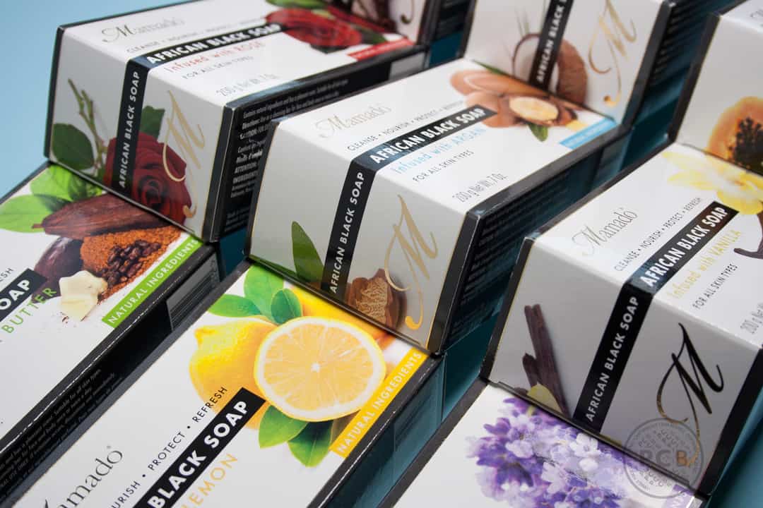
A gold metallic foil is used as a highlight to the Mamado logo and its ‘M’ icon and to fine key-lines that run around each soap carton – all finished with a gloss UV varnish.
We have also worked on soap packaging graphics for a variety of other clients including;
Soap wrapper designs for Beauty Kitchen
