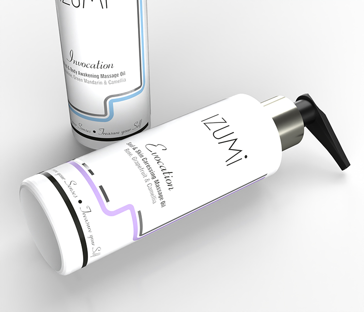
Izumi Skincare contacted us for our help in the design of a massage oil product identity with a very specific style.
Comprising of two products; Invocation (an awakening formulation and Evocation (a soothing caressing variety), the founder member’s Japanese background was a key influence in the direction of the design.
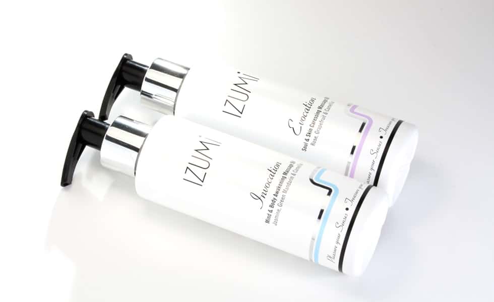
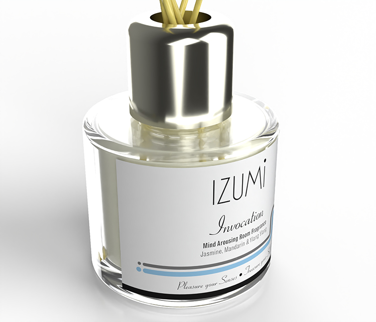
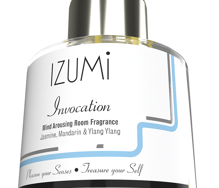
The brand name – ‘izumi’ meaning ‘source’ – a source of water, pleasure, knowledge etc. is reflected in the ‘wave’ style graphic detailing that runs around the base of the bottle label.
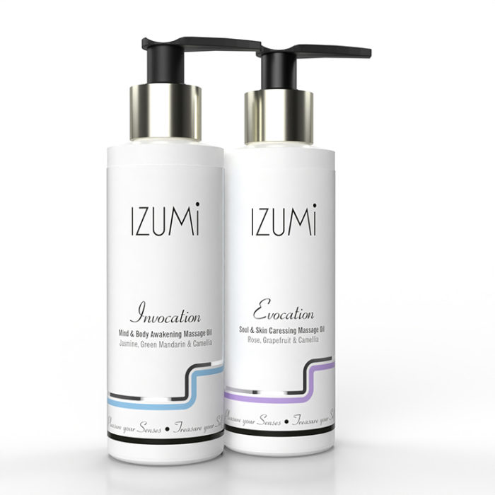
Initial design concepts featured a very 1920s look, tie-ing the white bottles with glossy black pumps and silver collar with a stark monochrome graphic and silver foil detailing. A soft highlight colour has been introduced to allow differentiation between the two types of products.

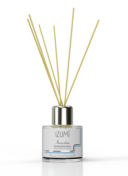
Following on from the massage oil product identity we also asked to design the labelling for the brand’s new range of fragranced reed diffuser products with similar invigorating and soothing properties respectively.
The products are available online at www.izumi-skincare.co.uk
For details of other home fragrance brands we’ve either designed or developed, please see Wild Celia and Urban Olfactory projects. If you have a brand that needs its artwork or design developing or maintaining then you may find our work for Urban Apothecary of interest.