Chawtons Aromatherapy approached us to overhaul the product identity of their existing therapy product range with a brief to bring the identity up to date and make it more appealing to a broader/younger market.
OUT WITH THE OLD…
The previous identity consisted of a more traditional and dated brown and orange colour scheme with a seed head icon. These, when used on amber glass medicine-style jars gave the product a much older and narrower appeal,
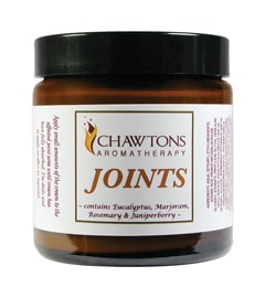
IN WITH THE NEW!
Working with the company’s new logo, the aromatherapy range has now been fully updated and divides into three clear sections: Therapeutics, Soaks and Rollerballs.
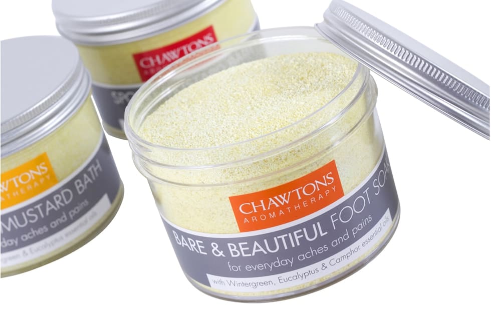
The label design has been completely overhauled – the original seed head icon removed and the Chawtons Aromatherapy lettering positioned front and centre, to form a colour-coded tab. The product information is now large and legible and uses the full space available on the die-cut full-wrap labels.
THERAPEUTICS PRODUCTS
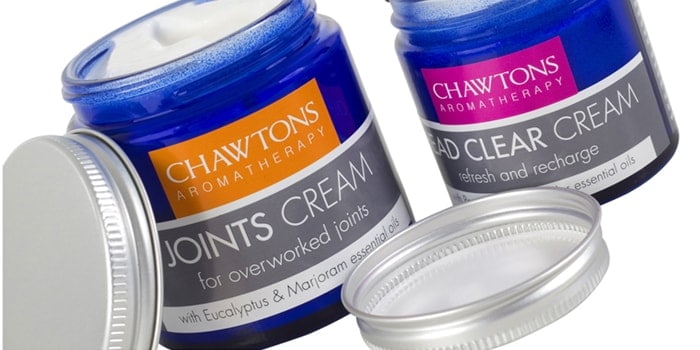
The glass therapy product jars, which contain the cream-based products, have now moved on from the heavy, medicinal amber glass versions, to an attractive blue version, topped off with modern, aluminium screw-cap lids.
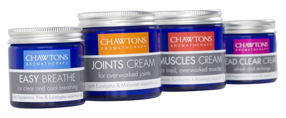
The therapy product name and other features and benefit details appear below the logo on a modern grey background – common to all labels.
NEW SOAKS!
The bath soaks are now packaged in large, stylish transparent jars, again with aluminium lids. The product varieties are now highly recognisable, due to their strong colour coding and bold titling, enabling the products to be merchandised together and easily identified by all ages.

ON THE PULSE
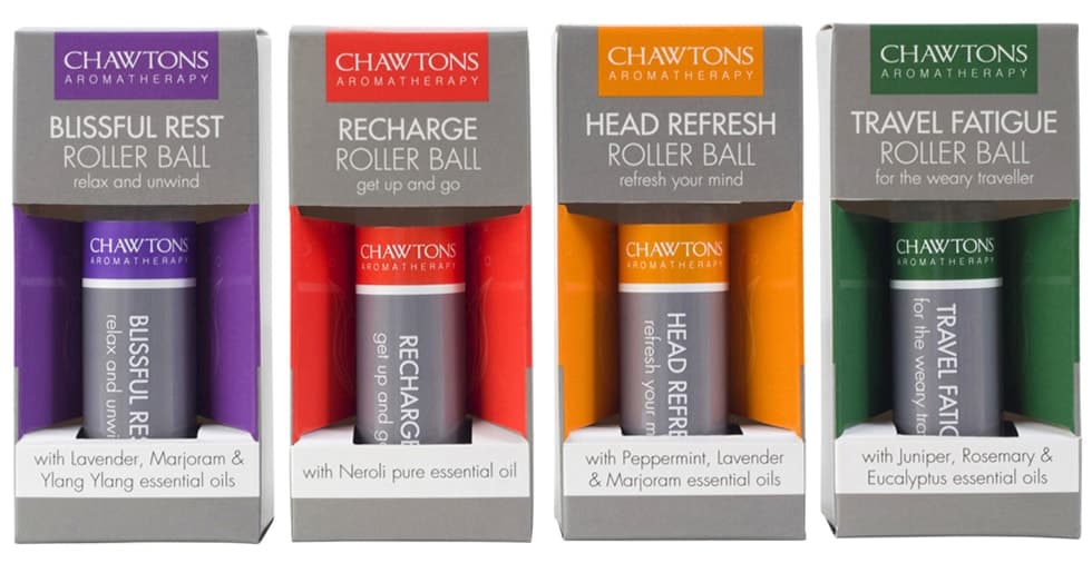
The carton graphics of a range of pulse-point rollerballs (shown below) have also been refreshed and feature the same consistent grey colouration with specific colour-coding for each variant to match the rest of the therapy product identity.
The newly refreshed range is available from the brand’s website at www.chawtons.co.uk.
