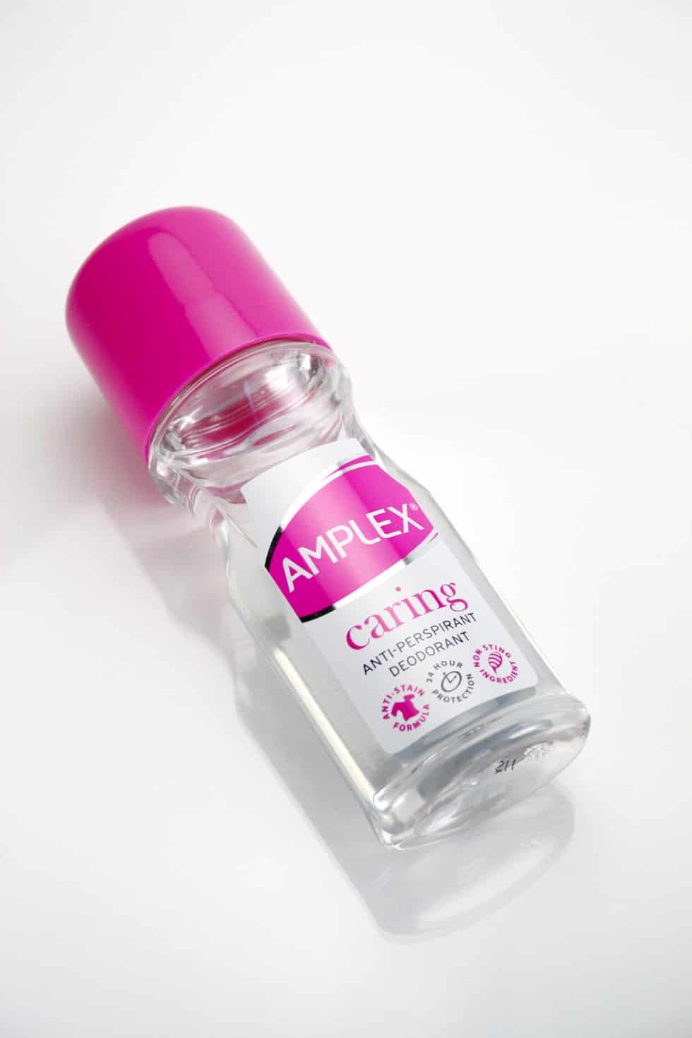
PROJECT: We were approached by Network Health & Beauty to re-design the brand logo for 80’s health and beauty brand Amplex and at the same time to re-design of the deodorant label graphics of a range of low-priced, unisex roll-ons. The existing logo had poor shelf appeal and the deodorant labelling was inconsistent and tired.
THE LOGO
The new logo maintains aspects of the feel of the original logo, but has been re-set in a new typeface. It now sits within a more dynamic ‘swoosh’ that allows for the logo to act more as a free-standing badge with its own background. It now offers opportunities for colour-coding and further print finishes.
THE LABEL GRAPHICS
With regards to specifics of the deodorant label graphics, we looked at a series of concepts that incorporated the elliptical nature of the logo and that featured areas that could be used to divide up the range. Extracts from the project are shown below with metallic materials, icons and ultimately plain colour being considered.
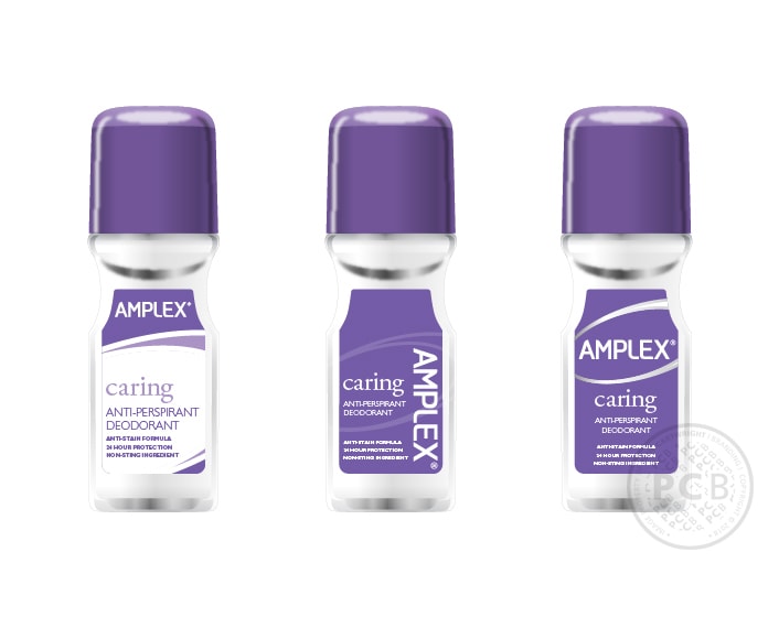
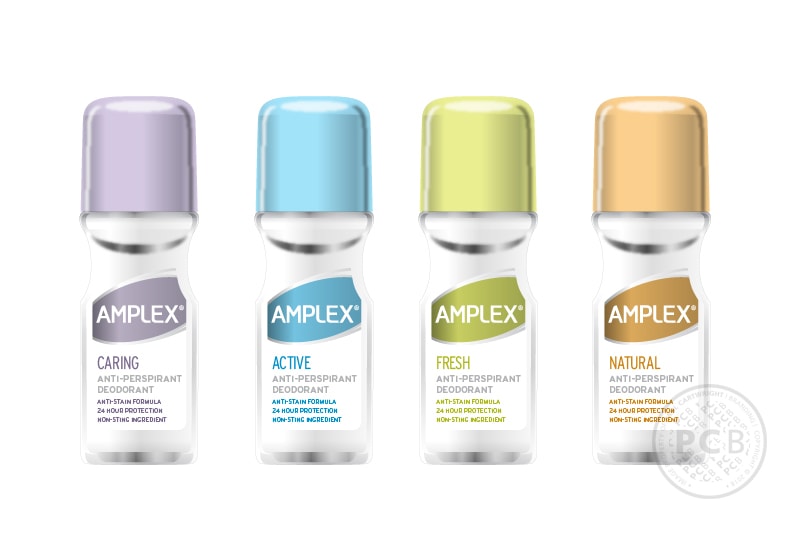
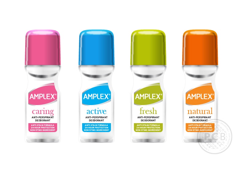
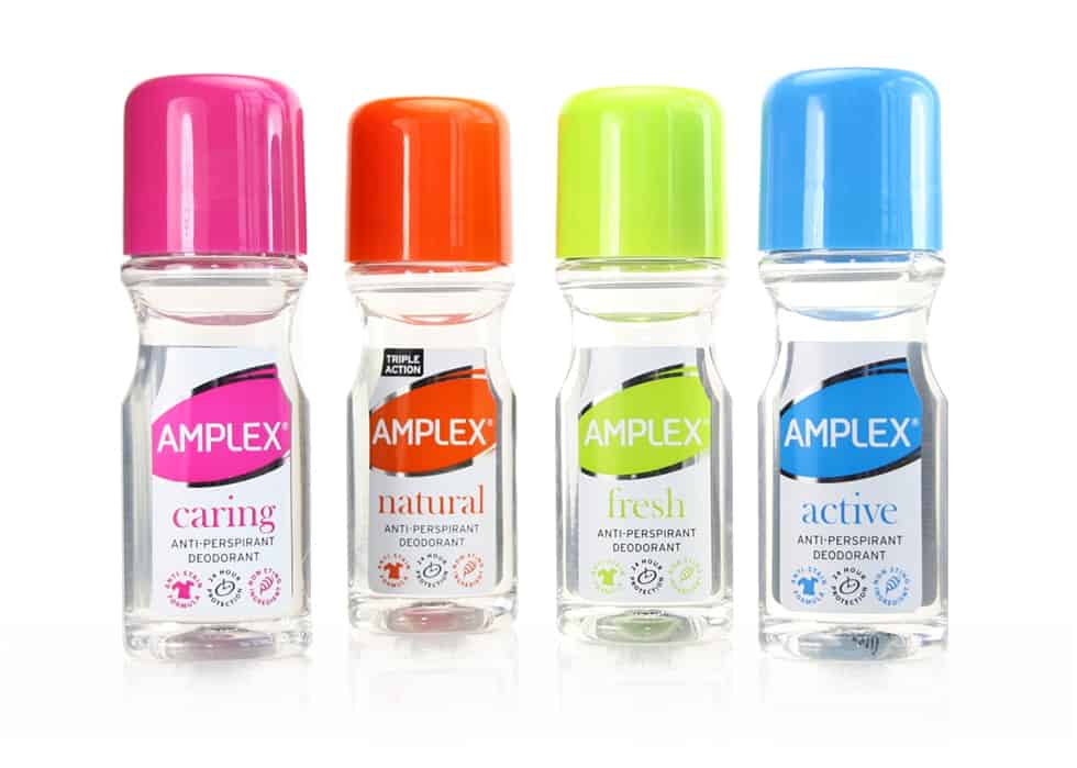
The outcome of the project is a set of 4 visually striking deodorants with label graphics featuring silver foiled detailing and matching caps which have true, on-shelf ‘shout’.
FROM THE CLIENT:
We hired Paul Cartwright with a view to updating and rebranding our Amplex Roll-on and Amplex Capsules brands. This involved a new brand logo, together with packaging ideas. We were very impressed with Paul’s ability to understand our business, to understand what we required and his creativity and knowledge when conceiving options for the rebranding exercise. Based on the success of this project, we have subsequently hired Paul Cartwright Branding to develop our new company identity plus work on three further brand projects.
GARY CLARKE | MANAGING DIRECTOR (Network Health & Beauty Ltd.)
The new products are initially available at Wilkinsons and Savers stores and independent pharmacies.
Another personal care product also designed for this client is our work on the re-design of Goldspot’s breath freshening sprays.
